PROJECT OVERVIEW
How can we engage parents and showcase Curiosity Cottage’s mission of sustainability and community impact through an e-commerce platform?
Curiosity Cottage is an LA-based company founded by a parent couple, offering thoughtfully designed children's apparel and pop-up experiences. While their long-term vision centers on providing childcare and early education services, the brand currently focuses on building community through their sustainable clothing line and local events.
THE PROBLEM
Standing out is a challenge for small businesses with big values in a market that prioritizes convenience over connection.
As a small business with a mission to offer sustainable children’s products, Curiosity Cottage faces the challenge of standing out in a crowded market. Traditional e-commerce platforms often focus solely on products, making it difficult for brands with strong ethical values to engage customers in meaningful ways.
THE SOLUTION
An e-commerce platform that promotes sustainability, storytelling, and interactivity with parents/guardians.
To elevate their current brand, I was tasked with designing a new site that not only showcases their products but also tells their unique story, encourages customer participation in sustainability efforts, and fosters a deeper connection with the brand.
RESEARCH: ANALYTICS
Utilizing Google Analytics to identify customer profiles and understand customer behaviors.
To begin the website design process, I first analyzed the user traffic on the business's temporary Shopify website using Google Analytics & Shopify Analytics. I discovered the following:

Bounce Rate
80%
Suggested confusion or lack of engagement. Signals the need for a stronger branding and clearer CTAs.
Target Audience
Women
Age 65+
Highlights the need for accessibility considerations and clear messaging.
Highest
Drop-Off Point
Homepage
Shifts focus to capturing attention via the homepage and building a stronger brand identity.
RESEARCH: HEURISTIC EVALUATION
Performing a heuristic evaluation to further investigate potential reasons behind the high bounce-rate.
Our team did not have the resources to perform any user interviews at the time, so instead, I decided to perform a heuristic evaluation, analyzing potential pitfalls of the current website using Nielson's 10 Usability Heuristics. I identified key areas of improvement with the following heuristics:
Heuristic #4: Consistency & Standards
The current website displayed a severe lack of consistency and standards. It used a variety of typefaces. font sizes and font weights. Spacing between sections was also inconsistent.

Heuristic #8: Aesthetic & Minimalist Design
Due to the inconsistencies mentioned before as well as misplaced graphics/images, the homepage was visually cluttered, causing the site to feel unorganized, unprofessional, and overall visually dispelasing.
Heuristic #10: Help Users Recognize, Diagnose, and Recover from Errors
A major issue I found with the site was the prevalence of broken pages and links. These would result in error messages in the form of lengthy code.
RESEARCH: COMPETITIVE ANALYSIS
Analyzing competitor sites in the child-product space to identify best practices and areas for improvement in the new design.
In additon to a heuristic eval., I decided to perform a competitive analysis of similar brands to uncover what to do and what not to do when designing a child-product e-commerce platform.
All websites displayed cohesiveness and consistency in their designs, something that was lacking from our website. This made navigation straightforward and helped maintain a professional aesthetic throughout the site.
Some sites like Maisonette incorporated blogs, parenting tips, or story-driven content, providing value beyond products. This content helped build a sense of connection with the brand and encouraged longer visits.
Despite strong branding, a few sites had cluttered layouts and/or felt impersonal. Few prioritized interactive elements or emphasized values in the user journey, highlighting a gap that Curiosity Cottage can fill with thoughtful, engaging design.
IDEATION & PLANNING
Using my research, I organized my ideas and explored different design directions through wireframing, creating user flows, and putting together a site map.
Wireframes
Through extensive wireframing, I was able to visualize potential layouts and flows, allowing us to identify the most effective structure for the website. Regular brainstorming sessions with the product manager and lead developer were crucial for ideating on features we wanted to include and understanding the technical constraints.
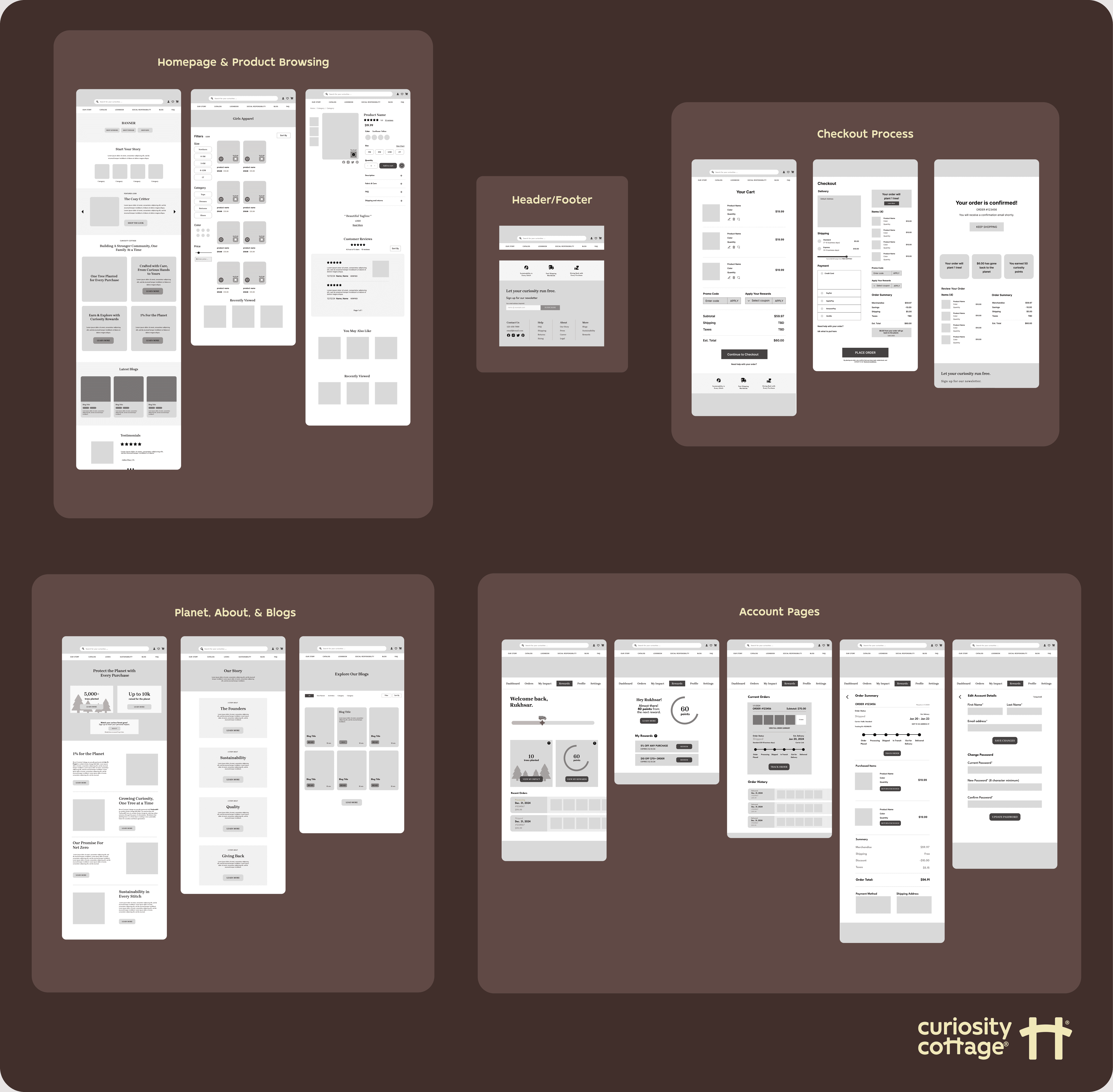
*Picture is not representative of the vast amount of iterations made. (I probably had around 3-5 iterations for each major flow!)
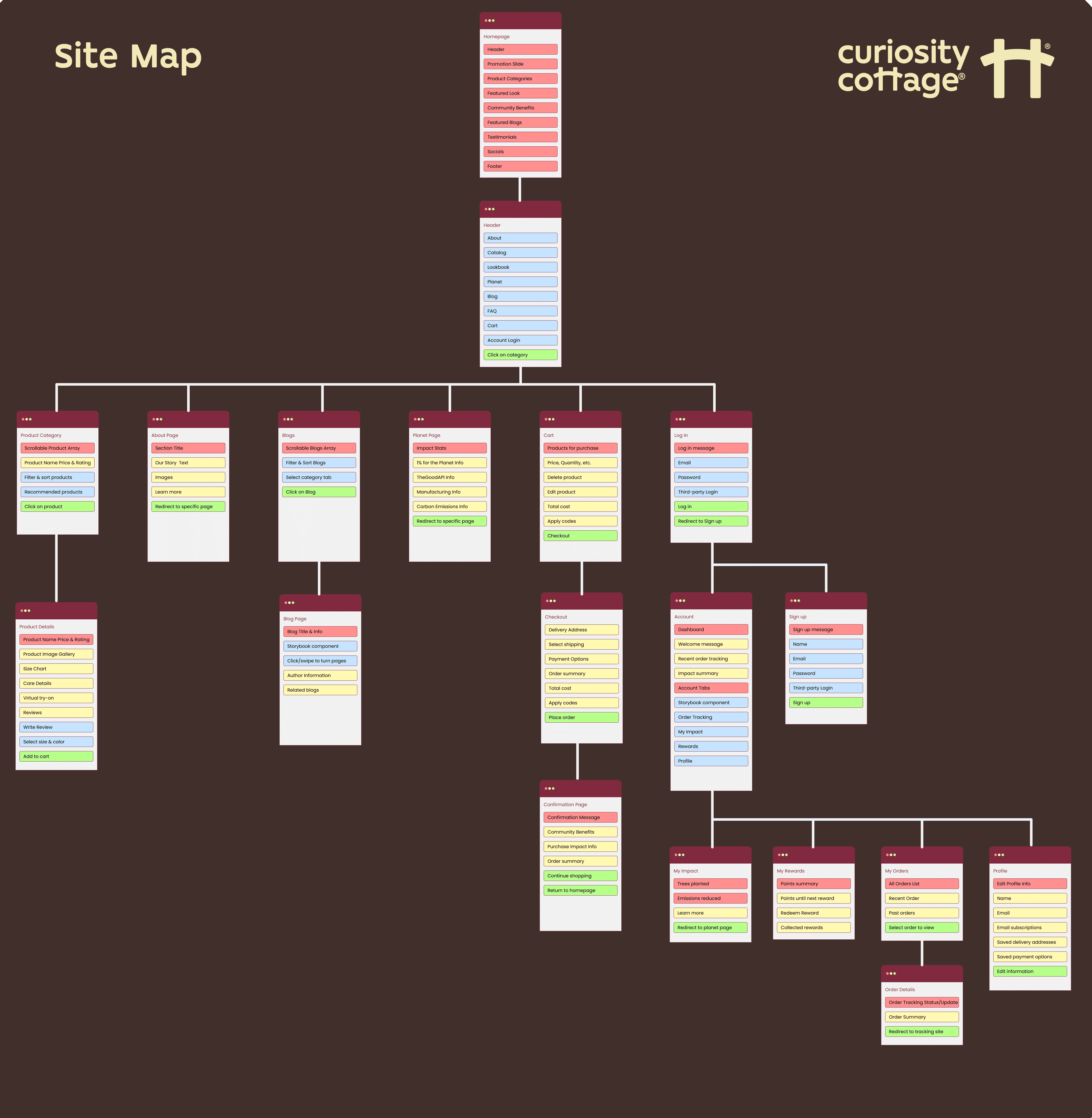
Sitemap
E-commerce sites often involve a complex web of many pages, which grew as I continued to ideate with the founder. To help with organization and communication, I created a sitemap that outlined the website's structure, helping both myself and the developers align on the site's user flow and overall layout.
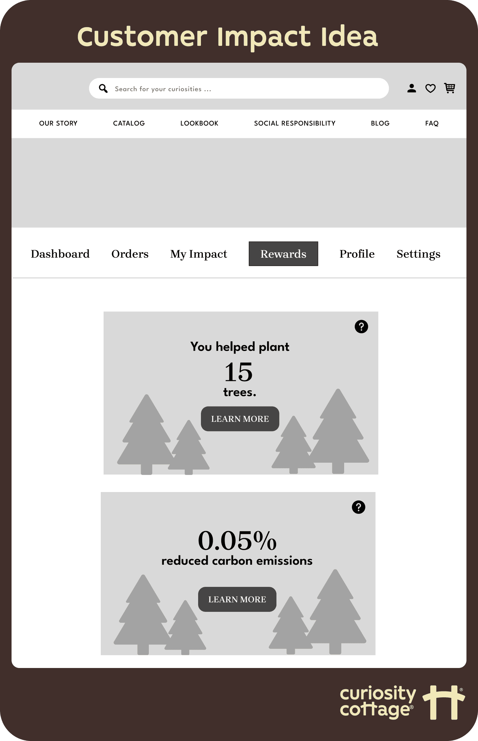
STANDING OUT
Incorporating interactive blogs and customer impact tracking to boost engagement and strengthen brand connection.
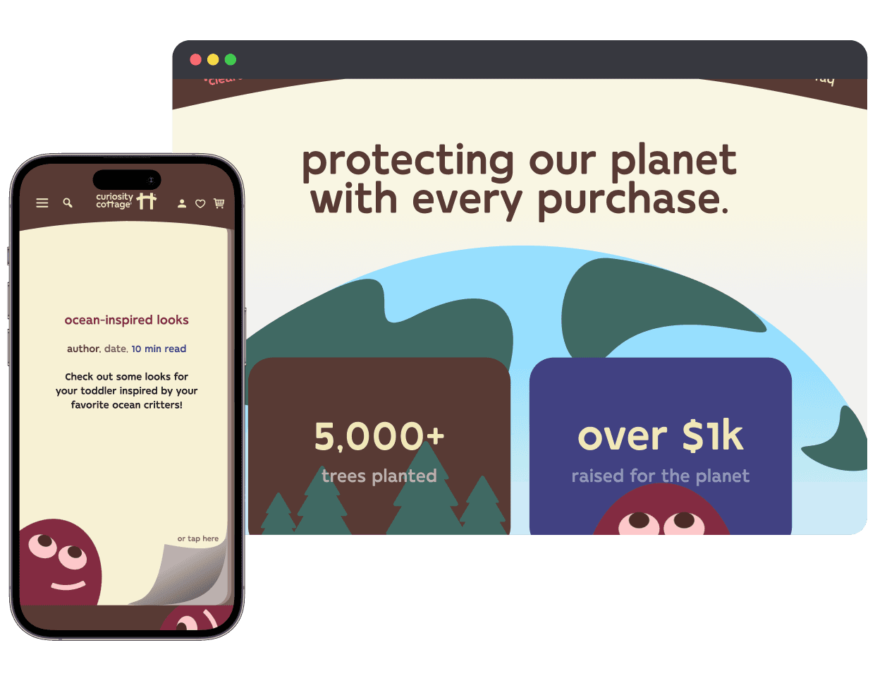
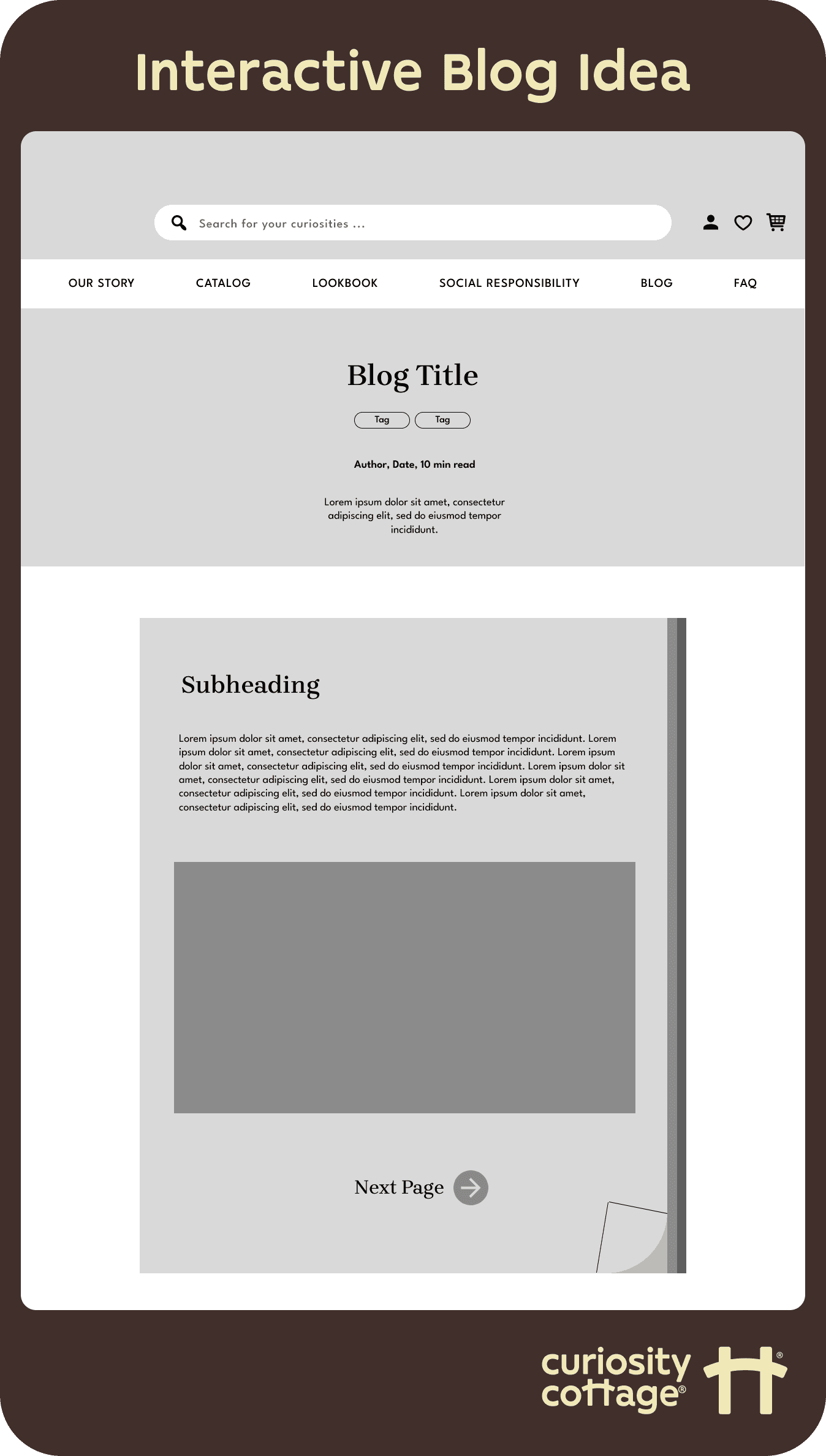
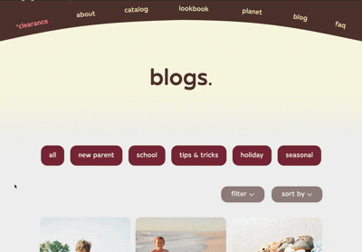
While ideating, I recognized the value in incorporating both interactive content, like a blog formatted like a storybook, and a feature to track customers' personal impact of their purchases on the environment. These additions would not only allow Curiosity Cottage to stand out from competitors and advertise its values but also encourage customers to actively participate in its mission. With this in mind, I drafted designs for both the blog section and the impact tracker, aiming to create a more immersive and meaningful user experience.
BRAND ALIGNMENT & VISUAL DESIGN
I collaborated with the marketing team to bring the wireframes to life by creating detailed mockups in Figma.
It was my responsibility to incorporate the marketing team's concepts into the website using Figma. By aligning on brand assets and visual direction, we ensured the designs accurately reflected the company's values and aesthetic while improving the user experience
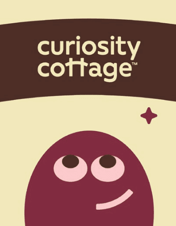
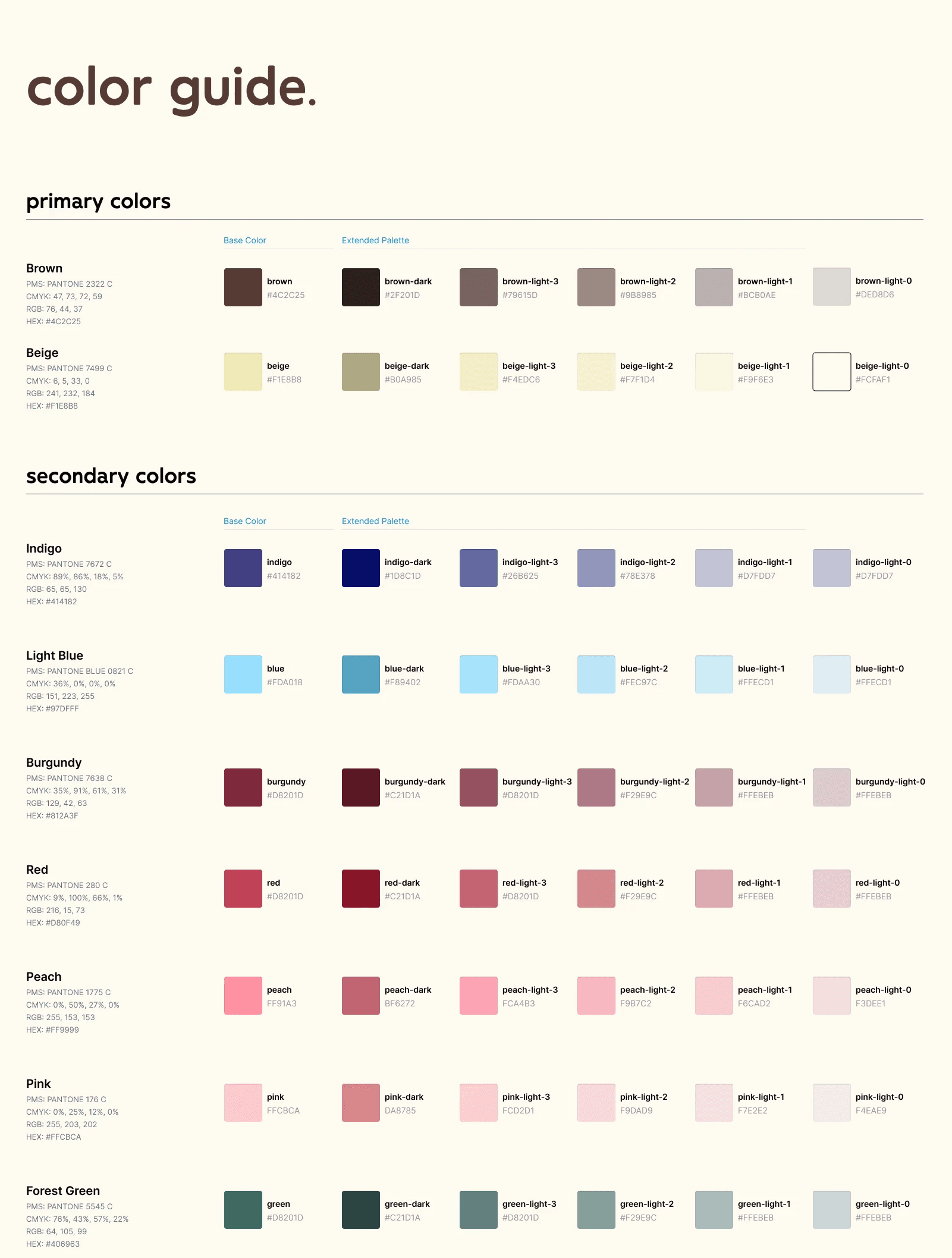
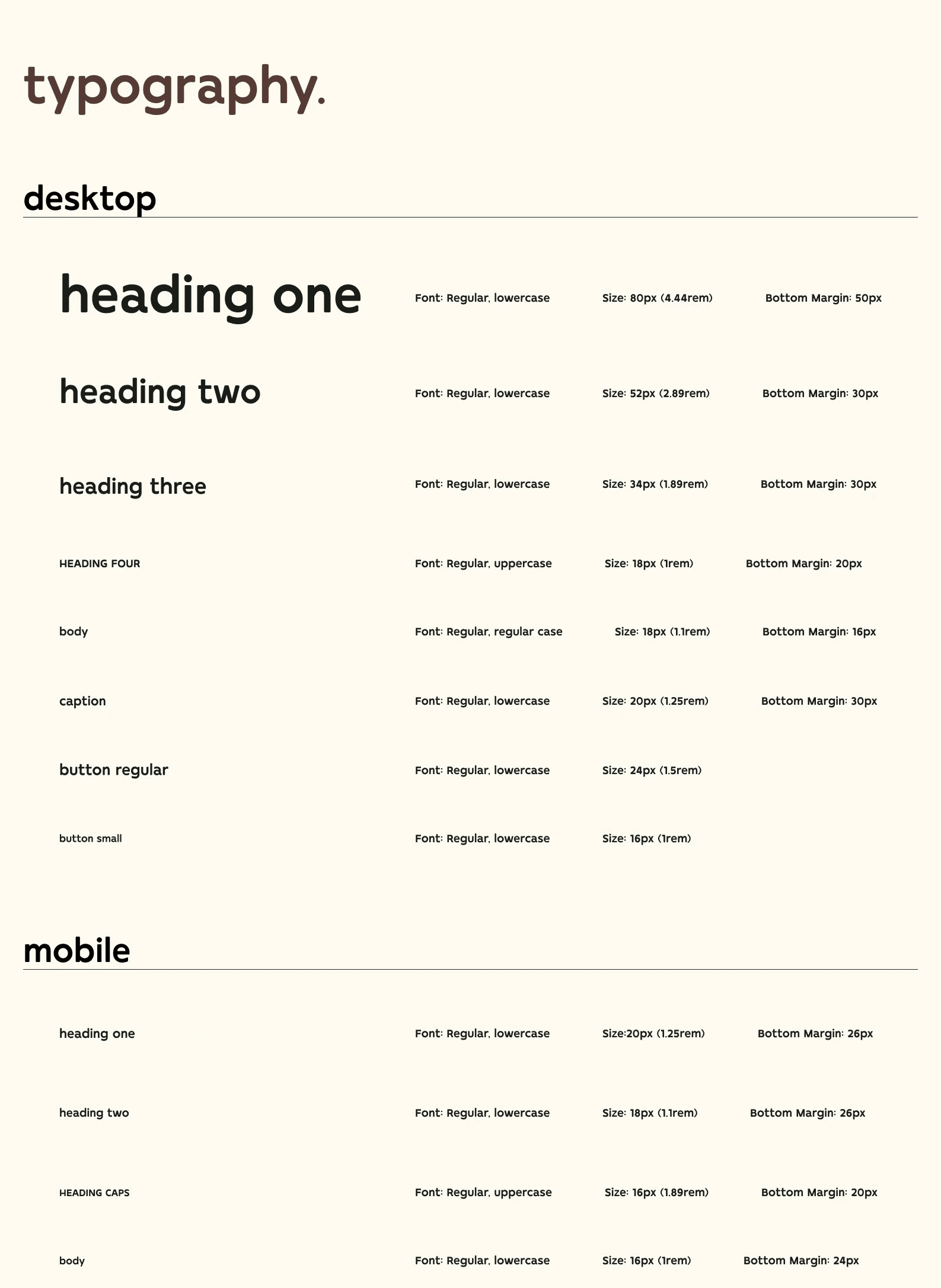
Branding & Style Guide
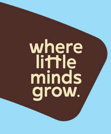
Our goal was to create branding that evoked a sense of curiosity, playfulness and professionalism all at once. To achieve this, we designed a simple abstract mascot character to bring a friendly, imaginative touch. The logo, an abstract shape symbolizing a cottage, and other organic shapes were used throughout the site to build a strong sense of brand identity. A mix of dark brown, pale yellow, and bright rainbow colors paired with modern, rounded typography helped maintain a fun, youthful, and approachable tone.
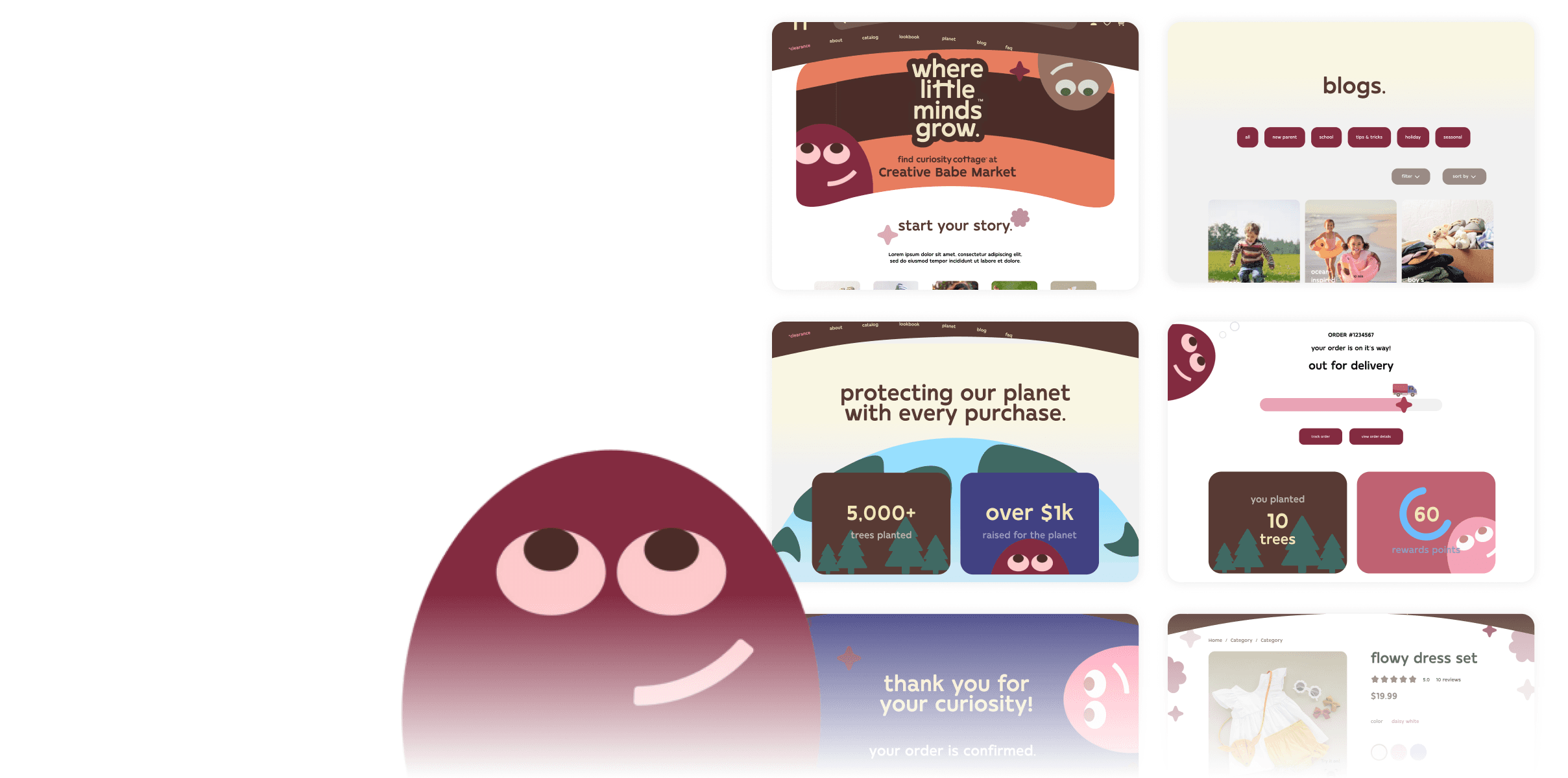
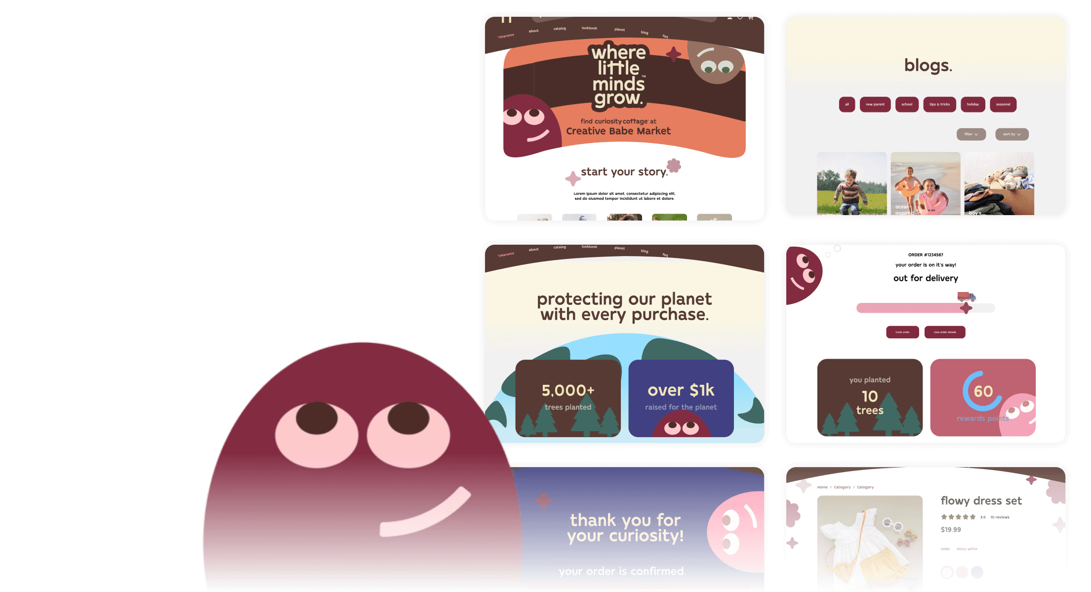
Figma Mockups
Once the branding was finalized, I translated it into Figma, ensuring that the design reflected the established visual direction. Throughout the process, I collaborated closely with the marketing team and PM to gather feedback and maintain alignment.
Homepage

Product Purchase

Blog Storybook
Rewards & Sustainability Tracking

PROJECT SUSPENSION
Due to changes in funding, the development on the website was unfortunately suspended.
Due to changes in funding, the development of the project was unfortunately suspended before we could complete key stages, including user testing. This was a significant challenge, as it limited our ability to validate the design decisions with real users. Despite this setback, the work completed up until that point provided valuable insights, and the project remains a solid foundation for future development once the necessary resources are secured.
WHAT'S NEXT
Using my designs to help inform a temporary Shopify platform.
Although the development of the project was suspended, I was able to leverage the designs I created to help inform the business’ temporary Shopify platform. Following my departure, the founder plans to apply the design principles, layout structure, and user-centered elements we developed to improve the site's functionality and customer experience. This allows the business to maintain consistency with its branding and values while preparing for the eventual launch of a more refined platform. Currently, the Shopify site is also suspended but the business still operates through in-person pop-ups and plans to resume their digital platform soon.
REFLECTION
A lesson about the complexity of designing for e-commerce brands and navigating design as a solo designer.
This project was a great learning experience for me, especially in terms of designing for e-commerce brands. I gained a deeper understanding of how to balance user experience with business goals while staying true to the brand’s identity. As a solo designer, I had to wear many hats and learn to manage all stages of the design process, whether that was on my own or in collaboration with other stakeholders. It was challenging, but it helped me improve my adaptability, communication skills, and ability to navigate obstacles, even when the project faced unexpected setbacks.